Laminate Colours – Complete Guide for Indian Buyers
Research-backed laminate colours breakdown with pros/cons, tables, and a clear decision checklist for Indian buyers and carpenters.
Quick Decision Summary
Best answer in one line: Choose laminate colours based on room function, natural light levels, and maintenance expectations—not just trends or personal preference.
If you're in a hurry: For Indian homes, neutral tones (beige, grey, off-white) work best in living areas and bedrooms due to dust visibility balance and resale appeal. Use darker shades (walnut, charcoal) for base cabinets in kitchens where stains are common. Avoid pure white in high-traffic zones unless you're prepared for frequent cleaning. Matte finishes hide fingerprints better than gloss in humid climates, but gloss reflects more light in dim rooms.
- Choose light colours if: Your room receives limited natural light, you want the space to appear larger, or you prefer a modern minimalist aesthetic.
- Choose dark colours if: The furniture will see heavy use, you want to hide stains and wear, or you're designing a formal/cozy space.
- Avoid high-gloss white if: Your home is in a dusty area, you have young children, or humidity levels are high (coastal/monsoon zones).
- Avoid very dark tones if: The room is small with poor ventilation, or if scratch visibility is a concern.
What Laminate Colours Actually Mean for Indian Buyers
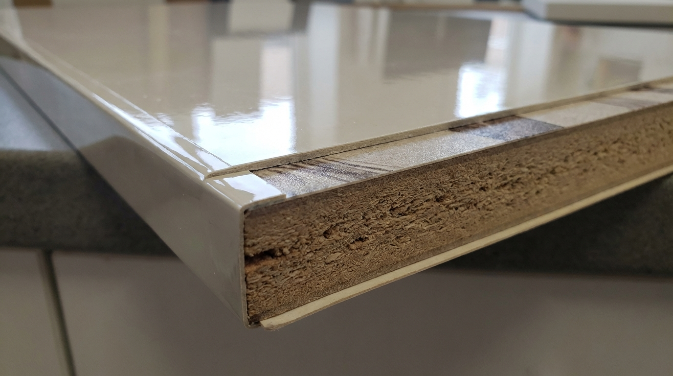
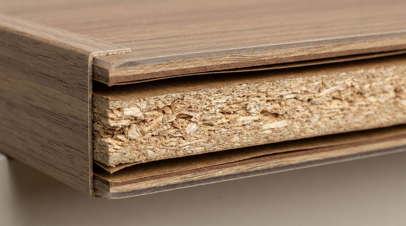
Laminate colours refer to the decorative surface layer of high-pressure laminates (HPL) or low-pressure laminates (LPL) that are bonded to substrates like MDF, plywood, or particleboard. This top layer carries the printed pattern—solid colours, woodgrains, marble effects, abstract textures, or digital prints.
The colour itself is embedded in a melamine-resin-impregnated decorative paper. Beneath it lies kraft paper layers that provide structural strength. The colour you see is permanent and doesn't require painting or polishing post-installation.
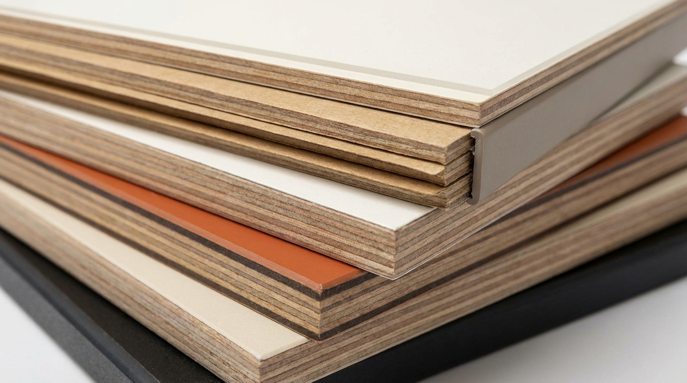
For Indian buyers, laminate colours are available in three broad categories:
- Solid colours: Uniform shades without patterns—whites, greys, blacks, pastels, bold hues.
- Woodgrain patterns: Simulate natural timber looks—teak, walnut, oak, maple, rosewood.
- Special finishes: Marble, stone, metallic, leather, fabric textures, or custom digital prints.
Each category comes in multiple finish options: matte, gloss, high-gloss, textured, anti-fingerprint (AFX), and suede. The combination of colour + finish determines both visual impact and practical performance.
Why Laminate Colour Selection Matters in Indian Homes and Sites
Indian interiors face unique challenges that directly affect how laminate colours perform over time. Understanding these factors prevents costly mistakes and buyer regret.
Does dust visibility change with laminate colour?
Yes, dust visibility varies dramatically by colour. Pure white and deep black surfaces show dust most prominently—white reveals dark dust particles, while black shows light-coloured dust and lint. Medium tones (beige, grey, taupe, medium brown) offer the best dust-hiding balance for Indian conditions where daily dusting isn't always practical. Textured finishes further mask dust by breaking up light reflection, making them ideal for kitchens and living rooms in urban apartments near main roads.
How does Indian humidity affect laminate colour choices?
Humidity doesn't directly affect the colour pigment, but it impacts the substrate beneath the laminate. In coastal cities (Mumbai, Chennai, Kolkata) or monsoon-heavy regions, moisture can cause edge swelling if substrates aren't sealed properly. Dark laminates show water marks and mineral deposits more readily than lighter shades. Matte finishes hide moisture spots better than gloss. If you're in a humid zone, choose colours that won't highlight accidental water exposure—medium greys, textured woodgrains, or stone patterns work well.
Why do some laminate colours fade near windows?
UV exposure causes gradual fading, especially in south-facing rooms with direct sunlight. Darker colours and bright saturated hues (reds, oranges, deep blues) are more prone to noticeable fading than neutrals. If your furniture placement puts laminates in direct sun for several hours daily, consider UV-resistant laminates (available from various manufacturers) or stick to lighter, less saturated colours that won't show fading as prominently.
Laminate Colour Categories Explained
Solid Colours: When Do They Work Best?
Solid colour laminates create clean, contemporary aesthetics. Whites and off-whites make spaces feel larger and work well in compact Indian apartments. However, they demand regular cleaning. Pastels (mint, blush, powder blue) add personality to children's rooms or accent furniture. Bold colours (navy, emerald, terracotta) work as accent panels but can overwhelm when overused. For Indian homes, solid colours perform best on wall-mounted units, wardrobes in master bedrooms, and feature walls—areas with less direct contact and wear.
Woodgrain Patterns: Which Tones Suit Indian Interiors?
Woodgrain laminates remain the most popular choice for Indian furniture. Light woodgrains (maple, ash, light oak) suit modern and Scandinavian aesthetics but may look out of place in traditional homes. Medium tones (teak, walnut) align with classic Indian furniture sensibilities and complement wooden flooring commonly found in apartments. Dark woodgrains (rosewood, mahogany, wenge) create formal, elegant looks but can make rooms feel smaller if overused. The key rule: match undertones—warm woods pair with warm wall colours, cool woods with grey or blue walls.
Stone and Marble Patterns: Are They Practical?
Marble-effect laminates are trending for kitchen counters, TV unit backdrops, and bathroom vanities. They offer the aesthetic of natural marble without the porosity and maintenance concerns. However, the realism varies significantly across manufacturers and price points. Budget marble laminates often look artificial under direct lighting. For convincing results, choose laminates with subtle veining and matte or suede finishes rather than high-gloss options that highlight the printed nature of the pattern.
Price Range and Cost Drivers for Laminate Colours
Laminate prices in India vary based on several factors, and colour/pattern is one of them—though not always the primary driver.
| Laminate Type | Approximate Price Range (per sheet, 8x4 ft) | Key Cost Factors |
|---|---|---|
| Solid colours (standard matte) | ₹1,200 – ₹2,200 | Finish quality, thickness (0.8mm vs 1mm) |
| Woodgrain patterns | ₹1,400 – ₹2,800 | Texture depth, registration quality |
| High-gloss laminates | ₹2,200 – ₹4,500 | Mirror finish grade, anti-scratch coating |
| Anti-fingerprint (AFX) | ₹3,500 – ₹5,500 | Special surface treatment technology |
| Digital print / custom | ₹2,500 – ₹6,000+ | Design complexity, minimum order quantities |
| Stone/marble patterns | ₹1,800 – ₹3,500 | Realism quality, finish type |
Cost drivers beyond colour:
- Thickness: 0.8mm is standard; 1mm and 1.5mm cost more but offer better impact resistance.
- Finish type: Matte is most affordable; textured and anti-fingerprint command premiums.
- Brand tier: Premium segment pricing can be 30-50% higher than economy ranges.
- City and logistics: Prices in tier-2 cities may include higher transport costs.
- Wastage factor: Complex cuts and patterns increase effective per-unit costs.
How to estimate laminate costs for a wardrobe project?
For a standard 8x7 ft wardrobe with external laminate cladding, you'll typically need 3-4 sheets (accounting for wastage). At mid-range pricing (₹2,000/sheet), laminate material cost would be ₹6,000–₹8,000. Add 15-20% for edge banding and adhesive. Premium finishes or coordinated interior-exterior colour schemes can push this to ₹12,000–₹15,000 for laminate materials alone. Always request itemized quotes specifying colour code, finish, thickness, and per-sheet rate.
Two-Minute Comparison: Colour Families and Their Trade-offs
| Colour Family | Best For | Avoid For | Maintenance Level | Scratch Visibility |
|---|---|---|---|---|
| Pure White | Modern kitchens, compact spaces | High-traffic areas, dusty zones | High | High (shows scratches clearly) |
| Off-white / Cream | Living rooms, bedrooms, versatile | Industrial/masculine aesthetics | Medium | Medium |
| Light Grey | Contemporary looks, offices | Warm traditional interiors | Low-Medium | Low |
| Dark Grey / Charcoal | Accent panels, base cabinets | Small dark rooms | Medium (shows dust) | Medium-High |
| Light Woodgrain | Scandinavian, casual modern | Heavy-use kitchens | Low | Low |
| Medium Woodgrain (Teak/Walnut) | All-purpose, Indian classics | Ultra-modern minimalist spaces | Low | Low |
| Dark Woodgrain | Formal areas, accent pieces | Small rooms, children's areas | Medium | Medium-High |
| Pastels | Kids' rooms, accent furniture | High-wear surfaces | Medium | Medium |
| Bold Colours | Feature walls, retail displays | Entire rooms, resale-focused homes | Medium-High | High |
Key insight: Medium-toned woodgrains and light greys offer the best balance of aesthetics, maintenance, and scratch concealment for most Indian homes. Reserve bold choices for accent applications where replacement is easier.
Decision Framework: Choosing Laminate Colours by Condition
| Your Condition | Recommended Colour Approach | What to Verify |
|---|---|---|
| Wet zone (kitchen near sink, bathroom vanity) | Medium greys, stone patterns, matte finishes; avoid pure white | Confirm substrate is BWR grade; check edge sealing |
| Coastal/high humidity area | Textured finishes, medium woodgrains; avoid high-gloss dark colours | Verify moisture-resistant substrate; ensure proper ventilation |
| Heavy daily use (kitchen base cabinets, kids' wardrobes) | Dark or medium woodgrains, textured solids; avoid pure white and pastels | Check laminate thickness (1mm preferred); anti-scratch options |
| Tight budget | Standard woodgrains in matte finish; avoid custom prints and AFX | Compare sheet prices across 2-3 suppliers; negotiate on volume |
| Fast delivery needed | Stock colours (whites, greys, popular woodgrains); avoid custom orders | Confirm stock availability before finalizing design |
| High scratch risk (commercial, children, pets) | Medium textured finishes; avoid high-gloss and dark solids | Ask for scratch-resistance rating; consider post-formed edges |
| Limited natural light | Light colours, reflective finishes; avoid dark woodgrains on all surfaces | Test samples in actual room lighting conditions |
| Resale-focused investment property | Neutral colours (beige, grey, light woodgrain); avoid trendy or bold choices | Choose timeless patterns that appeal to broad buyer base |
Practical Use Cases: What Works and What Fails
| Application | Recommended Colours | Finish Notes | Risk Notes |
|---|---|---|---|
| Kitchen wall cabinets | Light to medium tones, coordinated with counter | Matte or anti-fingerprint preferred | High-gloss shows grease fingerprints |
| Kitchen base cabinets | Darker shades than wall cabinets | Textured for durability | Light colours show stains quickly |
| Bedroom wardrobes | Match or complement wall colour | Any finish works; matte is safest | Dark gloss shows dust in sunlit rooms |
| Living room TV unit | Feature colour or coordinated woodgrain | High-gloss acceptable for low-touch areas | Fingerprints near handles and remotes |
| Study/home office | Calming neutrals (grey, beige, light wood) | Matte to reduce glare | Bright colours may cause visual fatigue |
| Children's room | Pastels or medium woodgrains; accent with bold | Textured, anti-scratch | Dark colours make room gloomy; white shows marks |
| Bathroom vanity | Stone patterns, light greys, whites with matte finish | Ensure moisture-resistant substrate | Woodgrains may look dated; edge swelling risk |
| Commercial reception | Brand colours or premium neutrals | Anti-fingerprint, fire-retardant grades | Budget laminates show wear quickly |
Design Ideas You Can Actually Build
Kitchen Colour Combinations
- Two-tone contemporary: Light grey upper cabinets + dark walnut lowers; matte finish; aluminum edge banding; works in apartments with moderate natural light.
- All-white modern: Off-white throughout with stone-pattern countertop laminate; anti-fingerprint finish essential; best for homes with good ventilation and cleaning routines.
- Warm traditional: Medium teak woodgrain throughout; textured finish; matches Indian wood flooring; suitable for families preferring classic aesthetics.
- Bold accent: Neutral woodgrain base + one emerald or navy accent panel for tall unit; matte finish; creates focal point without overwhelming.
Wardrobe Colour Approaches
- Master bedroom classic: Walnut or oak woodgrain matching bed; matte or suede finish; coordinated handles; timeless for 10+ years.
- Compact room illusion: Light maple or white exterior; mirror panel integration; makes small bedrooms feel larger.
- His-and-hers contrast: Dark grey external frame + lighter internal compartments; helps differentiate sections visually.
- Children's playful: Pastel exterior (mint, peach) with white interiors; textured anti-scratch surface; wipeable finish essential.
Living Room and Entertainment Units
- Floating TV unit: Dark woodgrain or charcoal grey; high-gloss acceptable since touch is minimal; back-panel can be lighter for contrast.
- Display shelving: Light woodgrain or white for open shelves; highlights displayed items; avoid dark backgrounds that absorb light.
- Wall paneling: Textured woodgrain in vertical patterns; creates height illusion; matte finish prevents glare from lighting.
- Bar unit accent: Metallic or leather-texture laminate; adds sophistication; reserve for single feature unit.
Office and Commercial Applications
- Workstation partitions: Light grey or beige; matte finish for reduced eye strain; easy to maintain in shared spaces.
- Reception desk: Premium woodgrain or stone pattern; high-gloss creates upscale impression; requires regular cleaning protocol.
- Filing cabinets: Neutral colours matching overall palette; textured finish hides wear; handles should contrast for usability.
- Meeting room feature wall: Digital print or bold accent colour; creates branding opportunity; ensure colour accuracy with samples.
Common Buyer Mistakes and How to Avoid Them
Mistake 1: Choosing colours from digital screens alone. Screen colours vary significantly from physical laminates due to monitor calibration differences. Always request physical samples before ordering. View samples in the actual room where furniture will be installed, under both natural and artificial lighting conditions.
Mistake 2: Ignoring undertones in woodgrain patterns. Two "walnut" laminates from different manufacturers can have entirely different undertones—one warm (reddish), one cool (greyish). Mixing undertones creates visual discord. Place samples next to existing flooring, walls, and other furniture before deciding.
Mistake 3: Selecting high-gloss for kitchens without considering maintenance. High-gloss finishes look stunning in showrooms but reveal every fingerprint, water spot, and grease splash. Unless you're committed to daily wiping, choose matte or anti-fingerprint finishes for kitchen cabinets, especially near cooking and sink areas.
Mistake 4: Using the same colour for everything. Monochromatic schemes can work but often appear flat and boring. Create depth by using 2-3 complementary shades within the same colour family. Vary finishes (matte walls with subtle gloss accents) for visual interest.
Mistake 5: Not accounting for adjacent room colours. Open-plan Indian apartments mean kitchen, living, and dining areas are visually connected. Laminate colours should harmonize across these spaces. Jarring transitions between rooms create disjointed aesthetics.
Mistake 6: Choosing trendy colours for permanent fixtures. Bold trends (rose gold, millennial pink, concrete grey) may feel dated within 3-5 years. Reserve trendy colours for easily replaceable elements (cushions, accessories) and stick to timeless neutrals for built-in furniture.
Mistake 7: Forgetting about edge banding colour matching. Mismatched edge banding destroys the seamless look. When ordering laminates, simultaneously order coordinated edge bands from the same manufacturer and batch. Check colour codes match exactly.
Mistake 8: Underestimating lighting impact. The same laminate colour appears different in north-facing versus south-facing rooms, under warm LEDs versus cool daylight. Test samples under actual lighting conditions before finalizing. What looks perfect in a showroom may disappoint at home.
Mistake 9: Selecting dark colours for small spaces. Dark laminates absorb light and make compact rooms feel cramped. In Indian urban apartments where rooms average 100-150 sq ft, light colours with occasional dark accents work better than all-dark schemes.
Mistake 10: Not checking colour consistency across batches. Laminate batches can have slight colour variations. For large projects requiring multiple sheets, ensure all sheets come from the same production batch. Verify batch numbers on labels before accepting delivery.
Failure Modes and Fixes
Colour Mismatch After Installation
Symptom: Adjacent panels or edge banding appear noticeably different in colour despite same stated colour code.
Root cause: Different production batches, incompatible edge band source, or lighting variations exposing previously unnoticed differences.
Prevention: Order all materials from single batch; verify batch numbers; test edge band against laminate sheet before application; approve samples in actual installation lighting.
Fix if happening: For minor variations, repositioning panels to less visible areas may help. Significant mismatches require replacement. Document with photos for warranty claims or supplier negotiations.
Premature Fading
Symptom: Noticeable colour lightening or yellowing within 1-2 years, especially in sun-exposed areas.
Root cause: Prolonged UV exposure, low-quality pigments, or using interior-grade laminates in semi-outdoor conditions.
Prevention: Use UV-resistant grades for sun-exposed furniture; install curtains or blinds for south-facing windows; avoid saturated dark colours in direct sunlight.
Fix if happening: No reversal possible for faded areas. Apply UV-filtering window film to prevent further fading. For severe cases, replacement is the only solution.
Fingerprint and Smudge Accumulation
Symptom: Constant visible fingerprints on dark glossy surfaces, requiring excessive cleaning.
Root cause: Mismatch between finish selection and usage pattern; high-gloss dark colours in high-touch zones.
Prevention: Choose anti-fingerprint (AFX) or matte finishes for handles, cabinet faces, and frequently touched areas. Reserve high-gloss for decorative panels with minimal contact.
Fix if happening: Use microfiber cloths and appropriate cleaners. In extreme cases, consider applying a laminate overlay film with anti-fingerprint properties, though this is a temporary solution.
Scratch Visibility on Dark Surfaces
Symptom: Light-coloured scratches prominently visible on dark laminate surfaces, especially near handles and edges.
Root cause: Dark laminates expose the lighter substrate beneath when scratched; soft-touch finishes on dark colours are particularly vulnerable.
Prevention: Use textured finishes that mask minor scratches; apply protective films in high-wear zones; install proper handles to minimize surface contact.
Fix if happening: Minor scratches can be disguised with colour-matched laminate repair pens or wax sticks. Deep scratches require panel replacement.
Water Mark Staining
Symptom: Whitish rings or mineral deposit marks visible on laminate surfaces, especially near water sources.
Root cause: Hard water exposure, inadequate wiping after splashes, or poor edge sealing allowing moisture penetration.
Prevention: Wipe water immediately; seal all edges with appropriate sealant in wet zones; use coasters and drip trays near water sources.
Fix if happening: For surface deposits, try cleaning with diluted vinegar solution. For edge-related damage, professional resealing may help. Severe substrate damage requires replacement.
Colour Psychology Dissatisfaction
Symptom: Post-installation regret; room feels too cold, too dark, too sterile, or doesn't evoke intended mood.
Root cause: Inadequate pre-visualization; choosing colours in isolation without considering complete room context; following trends over personal preference.
Prevention: Create mood boards; use design visualization software; place large samples in the room for several days; consider how colours make you feel, not just how they look.
Fix if happening: Add soft furnishings in complementary colours to balance the space. Introduce plants, artwork, or textiles that modify the overall colour temperature. Full replacement is costly but sometimes necessary for long-term satisfaction.
Quality Checks You Can Do Without Lab Tests
Before Buying
- Visual inspection: Check for uniform colour across the sheet; look for print registration accuracy in patterns; examine edges for chipping.
- Touch test: Run fingers across surface; quality laminates feel consistent without rough spots or texture variations.
- Batch verification: Ask for batch numbers on all sheets; refuse mixed batches for visible applications.
- Sample comparison: Compare dealer sample against actual stock sheet; colour should match precisely.
- Bend test (for post-formed applications): Quality laminates bend slightly without cracking; poor quality will show stress marks.
Red flags to watch: Significant colour variation between sample and stock; visible print misalignment; surface bubbles or depressions; reluctance to provide batch information; prices dramatically below market range.
After Cutting
- Edge examination: Clean cuts show solid colour through the decorative layer; ragged edges indicate dull blades or improper cutting technique.
- Delamination check: No separation between layers should be visible at cut edges.
- Chip assessment: Minor chipping on back is acceptable; significant front-face chipping indicates cutting issues.
- Colour consistency: Compare multiple cut pieces under same lighting; all should match.
After Installation
- Alignment verification: Adjacent panels should align perfectly; gaps or steps indicate installation errors.
- Edge band inspection: Edge bands should be flush with surface, no lifting or gaps; colour should match panel face.
- Joint examination: Visible joints should be minimal and consistent in width.
- Cleaning test: Wipe entire surface with damp cloth; ensure no areas show uneven absorption or finish differences.
- Lighting review: Check surfaces under actual usage lighting; identify any previously unnoticed colour variations or finish issues.
Tips for Different User Types
For Homeowners
- Request physical samples of your top 3 colour choices; live with them in the actual room for at least 3-4 days before deciding.
- Clean laminate surfaces with soft, damp microfiber cloths; avoid abrasive scrubbers that scratch finishes.
- Don't place hot vessels directly on laminate surfaces; use trivets to prevent heat damage and potential colour changes.
- Maintain 50-60% relative humidity in air-conditioned rooms to prevent substrate stress that can affect laminate adhesion.
- Avoid harsh chemical cleaners; mild soap solutions work for most stains.
- Address water spills immediately, especially near edges and joints.
For Carpenters and Fabricators
- Use sharp TCT blades with appropriate tooth count for clean laminate cuts; dull blades cause chipping.
- Cut laminate face-up on table saws, face-down with jigsaws to minimize visible chipping.
- Pre-cut all visible pieces from same batch sheet to ensure colour consistency.
- Apply edge banding before final surface cleaning; adhesive contamination can show through light colours.
- Store laminate sheets flat in covered, dry areas; leaning storage can cause warping.
- For CNC routing, test settings on scrap pieces first; dark colours show routing burns more prominently.
- Drill hinge holes with backing support to prevent back-side chipping.
For Architects and Interior Designers
- Specify colour codes, finish types, and thickness in drawings and BOQs; avoid generic descriptions.
- Include batch matching requirements in specifications for projects requiring multiple sheets.
- Design for maintenance access; complex colour combinations in hard-to-reach areas create future problems.
- Consider colour longevity in design choices; specify UV-resistant grades for sun-exposed applications.
- Document approved samples with photographs and batch numbers for quality verification during execution.
- Account for colour perception under specified lighting in your design; coordinate with electrical consultant.
For OEM and Modular Furniture Manufacturers
- Establish colour tolerance specifications with laminate suppliers; document acceptable variation ranges.
- Implement incoming inspection protocols for batch consistency; reject non-conforming deliveries.
- Maintain sample libraries of all active colour codes for customer consultations and quality checks.
- Standardize popular colour combinations to reduce inventory complexity and batch-matching issues.
- Train assembly staff on colour-critical handling; fingerprints and scratches during assembly cause rejections.
- Include lighting specifications in showroom displays to accurately represent how colours appear to customers.
- Document and track colour-related complaints to identify problematic suppliers or batches.
FAQs
Which laminate colour is best for Indian kitchens?
Medium-toned woodgrains (teak, walnut) and neutral greys remain the most practical choices for Indian kitchens due to their balance of aesthetics and maintenance. These colours hide cooking stains, oil splashes, and daily wear better than pure whites or deep blacks. For contemporary kitchens, consider two-tone schemes with lighter upper cabinets and darker base units. Matte or anti-fingerprint finishes are strongly recommended over high-gloss for areas near cooking zones. The specific best colour depends on your kitchen size, natural lighting, and personal aesthetic preferences.
Does laminate colour affect room temperature perception?
Yes, colour psychology significantly impacts how we perceive room temperature. Light colours (whites, pastels, light greys) create a sense of coolness and space, making them suitable for hot Indian climates where psychological cooling helps. Dark colours (charcoal, deep brown, navy) absorb more light and create warmer, cozier feelings—better for bedrooms or formal areas where intimacy is desired. This perception is psychological rather than physical; actual room temperature remains unchanged, but occupant comfort can be affected by colour choices.
How do I match laminate colours with existing furniture?
Start by identifying the undertone of your existing furniture—whether it's warm (yellow, orange, red tints) or cool (blue, grey tints). Choose laminates with matching undertones. For direct matching, take a piece of existing furniture or a detailed photograph to laminate dealers for comparison. For contrasting schemes, use colours from opposite sides of the colour wheel but maintain undertone consistency. When in doubt, neutral greys and beiges coordinate with most existing furniture without creating jarring contrasts.
Should I choose the same laminate colour throughout my home?
Using the same colour throughout creates visual continuity and makes spaces feel larger, but can become monotonous. A better approach is choosing a cohesive colour family—different shades of the same colour or colours with matching undertones. Use 2-3 coordinated colours across the home, with the dominant colour covering 60%, secondary at 30%, and accent at 10%. This creates visual interest while maintaining harmony. For open-plan layouts common in Indian apartments, ensure adjacent rooms have visually connected colour schemes.
How long do laminate colours stay consistent before fading?
Quality laminates maintain colour consistency for 8-15 years under normal indoor conditions without direct sun exposure. UV exposure accelerates fading—furniture in south-facing rooms with direct sunlight may show noticeable fading within 3-5 years. Dark colours and saturated hues fade more noticeably than neutrals. To maximize longevity, use curtains or blinds during peak sun hours, choose UV-resistant grades for sun-exposed applications, and avoid placing laminated furniture directly in sunlight paths.
What laminate colours work best for small Indian bedrooms?
Light colours work best for compact bedrooms (100-150 sq ft common in Indian apartments). Off-white, light grey, pale woodgrains (maple, ash), and soft pastels visually expand the space by reflecting more light. Avoid dark colours on wardrobes that occupy significant wall space—they make rooms feel cramped. If you prefer darker tones, use them sparingly as accent panels or bed back designs while keeping larger surfaces light. Mirror integration with light-coloured wardrobes further enhances spatial perception.
Are white laminates practical for Indian homes?
White laminates are practical with caveats. Pure white shows dust, fingerprints, and stains prominently—manageable if you're committed to regular cleaning. Off-white or warm white variations hide imperfections better while maintaining the brightness benefit. For practical white applications, choose matte or anti-fingerprint finishes rather than high-gloss. White works well in bedrooms and formal living areas with lower traffic but may prove frustrating in high-use kitchens or children's rooms without disciplined maintenance routines.
How do I prevent laminate colour from looking outdated?
Classic colours resist dating better than trendy ones. Timeless choices include: medium browns (walnut, oak), true greys (not tinted), off-whites, and muted earth tones. Avoid saturated fashion colours (rose gold, millennial pink, concrete grey) that cycle in and out of trends. If you want trendy colours, apply them to easily replaceable elements—cushions, curtains, accessories—not built-in furniture. Natural woodgrain patterns generally stay relevant longer than abstract or geometric prints.
Can I mix different laminate colours in one piece of furniture?
Yes, mixing colours adds visual interest and is common in contemporary furniture design. Successful combinations include: different shades of the same colour family (light + dark grey), complementary natural combinations (walnut body + white drawers), or accent highlights (neutral body + single bold-coloured panel). Limit combinations to 2-3 colours maximum per furniture piece. Ensure selected colours have consistent undertones. Mismatched undertones—mixing warm and cool tones—create visual discord regardless of how attractive individual colours appear separately.
What laminate colours hide scratches best?
Medium-toned textured finishes hide scratches most effectively. Light woodgrains with visible grain patterns (oak, ash) camouflage minor scratches within the pattern. Medium greys and beiges don't show the substrate contrast that makes scratches visible on dark colours. Avoid solid dark colours (black, deep brown, navy) in gloss finishes—scratches appear as light lines against the dark background. If dark colours are essential, choose heavily textured finishes that break up light reflection and mask surface imperfections.
How do coastal humidity conditions affect laminate colour selection?
Coastal humidity doesn't directly affect colour pigments but impacts the overall appearance through secondary effects. Dark glossy surfaces show water marks and mineral deposits more prominently than lighter matte finishes. Moisture can cause edge swelling that creates visible lines and shadow variations near joints. For coastal locations, prioritize: matte or textured finishes over gloss, medium tones over dark, proper edge sealing, and moisture-resistant substrates. These choices minimize the visual impact of humidity-related issues rather than preventing them entirely.
Should laminate colour match flooring or walls?
Matching is one approach but not mandatory. Three coordination strategies work: matching (same colour family as walls or flooring), complementing (harmonious but distinct colours), or contrasting (deliberate difference for visual impact). For harmonious interiors, maintain undertone consistency even when colours differ. Light furniture against dark flooring creates grounding; dark furniture against light walls adds drama. Avoid exact matches between laminate and adjacent surfaces—slight variation prevents the space from appearing flat and monotonous.
Disclaimer: This content is provided for general informational purposes based on industry practices and publicly available information. Product specifications, standards, prices, and availability may vary by manufacturer, region, and time. Readers should independently verify details with manufacturers, dealers, or qualified professionals before making purchase or construction decisions.
Want Plywood Suggestions?
Share a few details and a VIR MDF specialist will suggest suitable brands and connect you to responsive dealers.